Flexible Layouts with Craft
Craft (the content management system created by Pixel and Tonic) comes with a Matrix field that allows you to set up repeatable "blocks" of content for storing data. Using the blocks below you can create robust, flexible layouts that will replace your WYSIWYG.
- New Section - Create new…sections and add blocks of color throughout the entry
- Heading - H1, H2, H3, etc.
- Text - a rich text field for bolding, italicizing, striking, list making, and linking
- Image - upload an image, resize it, and create columns
- Button - easily add a call to action that links to an entry, asset, or arbitrary URL
- Columns - all of the above in nice, neat columns
View an example built using only these blocks.
For those unfamiliar, a bit of back story
An older version of Matrix for ExpressionEngine
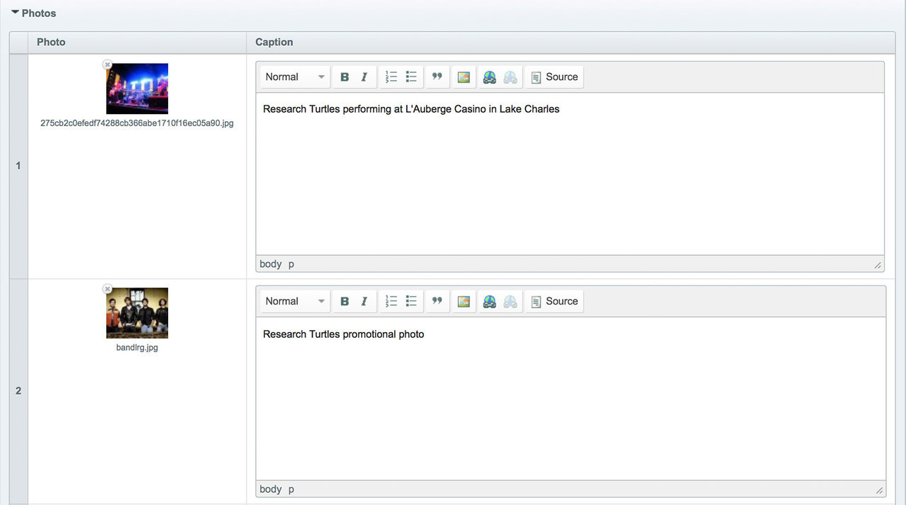
Pixel and Tonic originally created Matrix as a field type for ExpressionEngine that allowed you to create repeatable blocks of sub-fields for storing content. This came in handy when creating photo galleries, for example. Where you may have created multiple Photo entries and related them to an Album entry previously, Matrix allowed you to add a Photos field to an Album entry where each row contained a Photo and Caption sub-field that could be repeated for each image in the album. You could use this version of Matrix to accomplish impressive feats, but Matrix for Craft takes things to another level.
Matrix reloaded
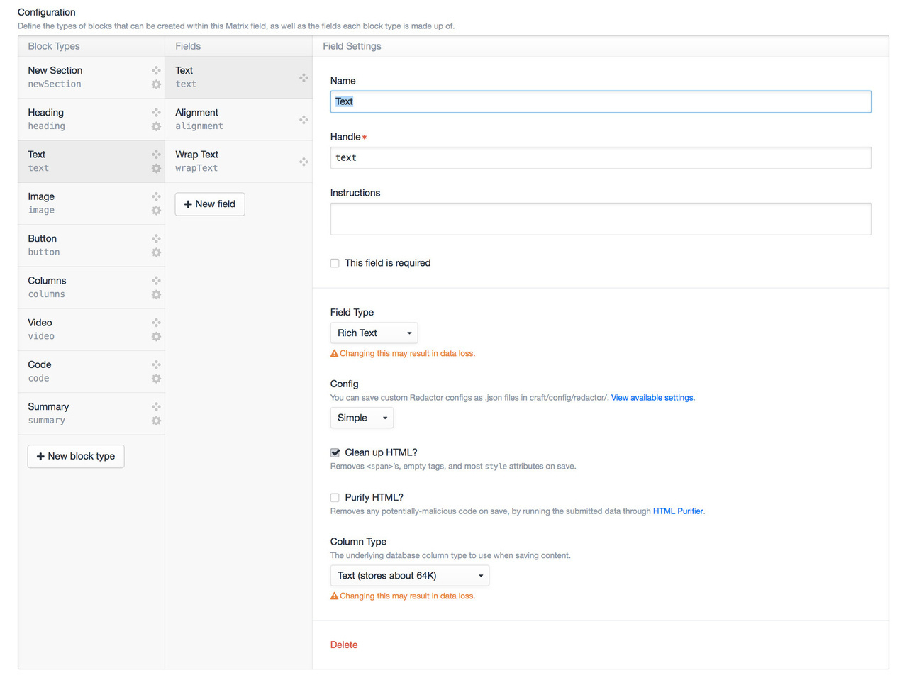
Matrix for Craft adds the ability to add multiple block types to a single Matrix field. Each block type has its own set of fields that can be mixed, matched, and repeated throughout an entry. New Section, Heading, Text, Image, Button, and Columns will be our building blocks.
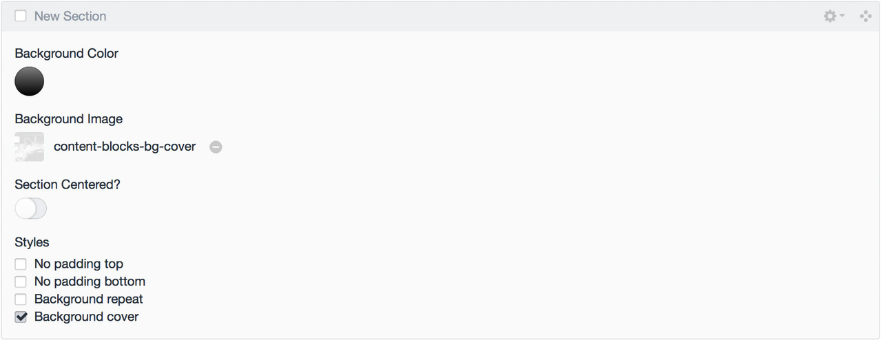
New Section
Create new sections and blocks of color throughout an entry (and add a bit of space between the previous section). Blocks following a New Section will be nested in that section until the next New Section is added or the Matrix field ends.
- Background Color (Color) — a color picker allowing you to set the color of the section
- Background Image (Assets) — upload an image or pattern to use as the section’s background
- Section Centered? (Lightswitch) — contain the content in this section to the
max-widthof the grid - Styles (Checkboxes) — select styles to apply to this section (i.e. remove padding from the bottom and/or tile the background image)
{%- set backgroundColor = backgroundColor is defined ? backgroundColor : null -%}
{%- set backgroundImage = backgroundImage is defined ? backgroundImage : null -%}
{%- set styles = styles is defined ? styles : [] -%}
{%- set sectionCentered = sectionCentered is defined ? sectionCentered : null -%}
{%- set previousSectionCentered = previousSectionCentered is defined ?
    previousSectionCentered : false -%}
{%- set firstSection = firstSection is defined ? firstSection : false -%}

{# Classes other than the _Styles_ checkboxes in the CP #}
{%- set classes = classes is defined ? classes : [] -%}
{# Add `has-bg` class if a background color or background image is selected #}
{%- if backgroundColor != "#000000" or backgroundImage|length -%}
    {%- set classes = classes|merge(["has-bg"]) -%}
{%- endif -%}

{% if not firstSection %}
    {# Close divs from previous section #}
    {% if previousSectionCentered %}
    {# Close wrapped content from previous block #}
        </div>{# /.column #}
    </div>{# /.row #}
    {% endif %}
</div>{# /.section #}
{% endif %}

<div
    {# markup.classes is a macro that takes an array of styles, an array of classes,
    ## and a string with any extra classes and joins them all together #}
    {{ markup.classes(styles, classes, "section") }}
    {%- if "has-bg" in classes -%}
        style="
            {%- if backgroundColor -%}
                background-color: {{ backgroundColor }};
            {%- endif -%}
            {%- if backgroundImage|length -%}
                {%- set image = backgroundImage.first() -%}
                background-image: url({{ image.url }});
                {#- Size the image @ 50% if it looks like a retina image -#}
                {%- if '[@2x@instagram.com](https://www.instagram.com/2x)' in image.filename and 'bg-cover' not in styles -%}
                    background-size: {{ image.width / 2 }}px {{ image.height / 2 }}px;
                {%- endif -%}
            {%- endif -%}
        "
    {%- endif -%}>

    {% if sectionCentered %}
    {# Wrap content to center #}
    <div class="row">
        <div class="column size1of1">
    {% endif %}
Note:* I use a simple macro (markup.classes) to output classes on each block. The macro combines the values selected in the Styles field and other classes set based on conditionals in the template and outputs them as a class attribute. The source is available here.*
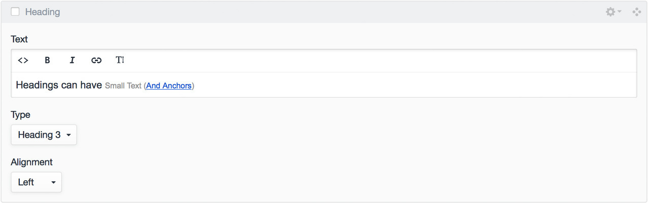
Heading
Add a heading. Why not just use a rich text field? Well, there is one in this block, but there’s a bit more for added flexibility.
- Heading (Rich Text) — a rich text field that uses Redactor’s linebreaks mode (so output isn’t wrapped in a block level tag) limited to bold, italic, links, and
smalltags - Type (Dropdown) — a dropdown with headings one through six
- Alignment (Dropdown) — align text to the left, right, or center
With the headings set up as blocks instead of lumping them in with a rich text field alongside paragraphs and lists, you have full control of the output in your templates. This makes adding IDs, jump links, and classes easier.
{%- set text = text is defined ? text : null -%}
{%- set headingType = headingType is defined ? headingType : "h1" -%}
{%- set alignment = alignment is defined ? alignment : "left" -%}
{%- set styles = styles is defined ? styles : [] -%}

{# Classes other than the _Styles_ checkboxes in the CP #}
{%- set classes = classes is defined ? classes : [] -%}

<{{ headingType }} {{ markup.classes(styles, classes, "text-" ~ alignment) }}>
    {{ text }}
</{{ headingType }}>
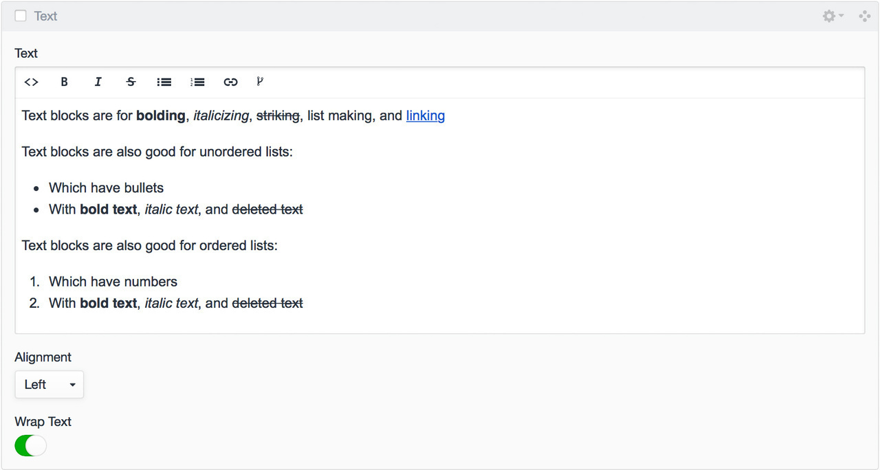
Text
Text is the main workhorse for your content.
- Text (Rich Text) — for bolding, italicizing, striking, list making, and linking
- Alignment (Dropdown) — align text to the left, right, or center
- Wrap Text (Lightswitch) — if switched on, your text will wrap any floated items (more on this below)
{%- set text = text is defined ? text : null -%}
{%- set alignment = alignment is defined ? alignment : "left" -%}
{%- set wrapText = wrapText is defined ? wrapText : true -%}
{%- set styles = styles is defined ? styles : [] -%}

{# Classes other than the _Styles_ checkboxes in the CP #}
{%- set classes = classes is defined ? classes : [] -%}

{%- if wrapText == false -%}
    {%- set classes = classes|merge(["no-wrap"]) -%}
{%- endif -%}

<div {{ markup.classes(styles, classes, "text-block text-" ~ alignment) }}>
    {{ text }}
</div>
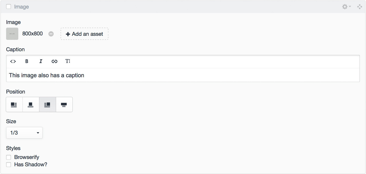
Image
Add images to your content, but also form columns around Text and other blocks for more complex layouts.
- Image (Assets) — for uploading or selecting the image
- Caption (Rich Text) — caption the image (this field could also be added to the asset itself, but sometimes it’s handy to have a different captions if an image is used in multiple places)
- Position (Position Select) — position the image to the left or right, keep it full-width, or center it
- Size (Dropdown) — how wide the image should be (i.e. full-width, half-width, etc.)
- Styles (Checkboxes) — select styles to add to the image (i.e. drop shadow)
{%- set wrapperStyles = wrapperStyles is defined ? wrapperStyles : [] -%}
{%- set wrapperClasses = wrapperClasses is defined ? wrapperClasses : [] %}
{%- set image = image is defined ? image : null -%}
{%- set caption = caption is defined ? caption: null -%}
{%- set position = position is defined ? position : null %}
{%- set size = size is defined ? size : null -%}
{%- set styles = styles is defined ? styles : [] %}
{%- set link = link is defined ? link : null %}

{% if image|length > 0 %}
    {% for image in image %}
        {# Assume an image is retina if `[@2x@instagram.com](https://www.instagram.com/2x)` is in the filename and
        ## set maxWidth @ 50% #}
        {%- set maxWidth = ('[@2x@instagram.com](https://www.instagram.com/2x)' in image.filename ? image.getWidth() / 2 : image.getWidth()) %}
        <figure {{ markup.classes(wrapperStyles, wrapperClasses, size ~ (position|length ? " align-" ~ position)) }}
        {# If an image is sized to 'natural' set a max width using the image's width
        ## (useful for centering an image in it's section/column) #}
        {% if size == "natural" %} style="width: {{ maxWidth }}px"{% endif %}>
            {% if link|length %}
                <a href="{{ link }}">
            {% endif %}
            {% include "_includes/markup/picture" with {
                image: image,
                size: size,
                styles: styles
            } %}
            {% if link|length %}
                </a>
            {% endif %}
            {% if caption %}
                <figcaption>
                    {{ caption }}
                </figcaption>
            {% endif %}

        </figure>
    {% endfor %}
{% endif %}
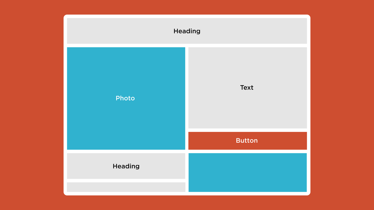
When these blocks combine…
Fancier layouts are created by pairing blocks with Position fields, such as Image blocks, with Text blocks. When Wrap Text is selected on the Text block, content that continues past the Image block will flow below the image. But without Wrap Text selected, text will continue down the page as its own column (this is accomplished by using overflow: hidden on the div wrapping the Text block). The Text block’s column width is the remaining space in the row. For example, a half-width image will create a half-width column of text and a two-thirds-width image will create a one-third width column of text.
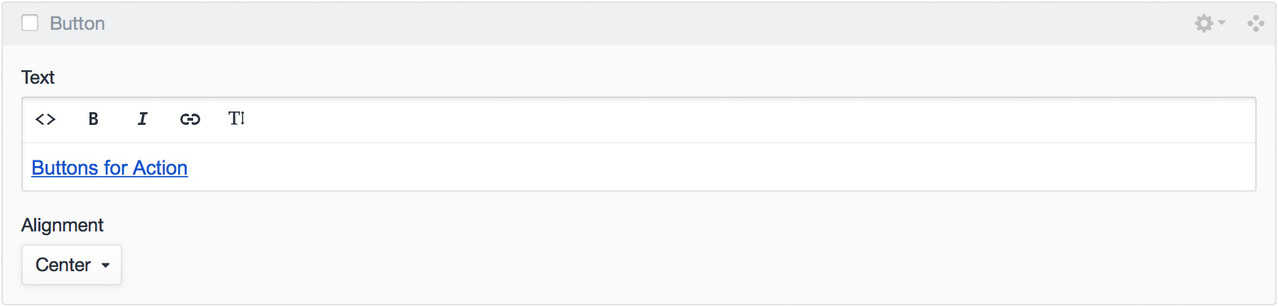
Button
Button blocks are great for adding call to actions throughout your entry.
- Text (Rich Text) — a rich text field that uses Redactor’s linebreaks mode (so output isn’t wrapped in a block level tag) limited to bold, italic, links, and
smalltags - Alignment (Dropdown) — align text to the left, right, or center
Additionally, you could add Style or Type fields for creating buttons with different appearances.
{%- set alignment = (alignment is defined ? alignment : "left") -%}
{%- set element = (element is defined ? element : "p") -%}
{%- set styles = styles is defined ? styles : [] -%}
{%- set text = (text is defined ? text : null) -%}

{# Classes other than the _Styles_ checkboxes in the CP #}
{%- set classes = classes is defined ? classes : [] -%}

<{{ element }} {{ markup.classes(styles, classes, "button-wrapper text-" ~ alignment) }}>
    {{ text }}
</{{ element }}>
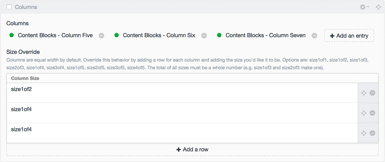
Columns
With the blocks above and some CSS and HTML, you can make robust visual layouts, but sometimes you need more than the two columns this approach allows. With a Columns block you can create as many columns as you need with all the block types mentioned here. This comes with a bit of added complexity. It’s currently not possible to nest a Matrix in a Matrix or have hierarchical fields, so the same *Content Blocks *field outlined here is added to another section named Snippets. When you need a more involved layout, create a Snippet entry for each column’s content and then add the entries to a Column block.
The content for these columns is created in a separate entry, but each column can be edited from the current entry once added to a Columnsblock.
- Columns (Entries) — select the snippet with the content you want to use for each column
- Size Override (Table) — override the size of each column, by default the columns will be equal widths based on the number of entries selected
{%- set columns = columns is defined ? columns : null -%}
{%- set sizeOverride = sizeOverride is defined ? sizeOverride : null -%}

{% if columns|length %}
    <div class="row">
    {% for column in columns %}
        {% if sizeOverride|length %}
            {# Make sure each column has a corresponding row and
            ## a value has been added to the row #}
            {% set columnSize = sizeOverride[loop.index0] is defined and sizeOverride[loop.index0].columnSize|length ?
                sizeOverride[loop.index0].columnSize : "size1of" ~ columns|length %}
        {% else %}
            {% set columnSize = "size1of" ~ columns|length %}
        {% endif %}
        <div {{ markup.classes(["column", columnSize]) }}>
            {% include "_includes/contentBlocks" with {
                contentBlocks : column.contentBlocks,
                previousSectionCentered : false
            } %}
        </div>
    {% endfor %}
    </div>
{% endif %}
Outputting the blocks
Looping through the block field outputs each block’s template based on the block.type to determine the correct template. The template for each block can be reused anywhere on the site by using an {% include %} with the variables expected by the template passed after the with keyword (see the Twig documentation). These variables are set at the top of each block’s template for reference.
{# Allow `blocks` variable to be overwritten if set with the include #}
{%- set contentBlocks = contentBlocks is defined ? contentBlocks : entry.contentBlocks %}

{# Ensure there are blocks to loop through #}
{% if contentBlocks|length %}

    {# Loop through the blocks #}
    {% for block in contentBlocks %}

        {# Load the appropriate template partial based on
        ## the block type #}
        {% switch block.type %}

            {% case "newSection" %}
                {% include '_includes/contentBlocks/newSection' with {
                    backgroundColor: block.backgroundColor,
                    backgroundImage: block.backgroundImage,
                    styles: block.styles,
                    sectionCentered: block.sectionCentered,
                    firstSection: false
                } %}

                {# Variables set inside an include are not available
                ## outside of that include, so variables needed by
                ## later includes are set here #}
                {%- set previousSectionCentered = block.sectionCentered %}

            {% case "heading" %}
                {% include '_includes/contentBlocks/heading' with {
                    text: block.text,
                    headingType: block.headingType,
                    alignment: block.alignment
                } %}

            {% case "text" %}
                {% include '_includes/contentBlocks/text' with {
                    text: block.text,
                    alignment: block.alignment,
                    wrapText: block.wrapText
                } %}

            {% case "image" %}
                {% include '_includes/contentBlocks/image' with {
                    image: block.image,
                    caption: block.caption,
                    position: block.position,
                    size: block.size,
                    styles: block.styles,
                } %}

            {% case "button" %}
                {% include '_includes/contentBlocks/button' with {
                    text: block.text,
                    alignment: block.alignment,
                } %}

            {% case "columns" %}
                {% include '_includes/contentBlocks/columns' with {
                    columns: block.columns,
                    sizeOverride: block.sizeOverride
                } %}

            {% default %}
                {% include '_includes/contentBlocks/' ~ block.type ignore missing %}

        {% endswitch %}

    {% endfor %}

    {# Close <divs /> left open by last newSection block #}
    {% if previousSectionCentered %}
            </div>{# /.column size1of1 #}
        </div>{# /.row #}
    {% endif %}

{% endif %}
Etc.
This method can be extended for other content types. I often create *Media *(to include videos and other embeddable content), Summary (to add content from other sections as grids or carousels), and Form (to add forms) blocks. View an example of these blocks in use.
Please send along any suggestions, corrections, or improvements via email or Twitter.

All Posts